Sarianne Gruber MPH, MS
SG Healthcare Analytics LLC
The Open Government Initiative has me exploring the health-related datasets available on www.data.gov/health. I recently had the chance to hear Todd Park, HHS Chief Technology Officer, champion the “Data Liberacion” project and learned there are over 250 free databases online for healthcare innovators and entrepreneurs to access. You can read more on the Open Government Partnership on Todd Park’s Sept. 20 www.hhs.gov/open.
I decided to explore the publically available Medicare Claims data starting with a downloadable Excel file of Total Counts of Claims Received by Region, State and Fiscal Year. This file is a good place to start to look at the distribution of data via maps and diagrams. The Office of Medicare Hearing and Appeals supplies this data file which I will touch upon later.
The claims listed in this file are ones that have been appealed through two levels before reaching OMHA. The process requires a claim to have been appealed to Level 1 and found to be unfavorable (wholly or in part), then appealed to Level 2 and found to be unfavorable (wholly or in part). Medicare claims reaching the third level are adjudicated by OMHA. An appeal may be made up of multiple claims. As part of the conversation on how to contain healthcare costs, there is debate on whether claims for procedures deemed not medically necessary are denied. Based on the claims data published in the 2008 National Health Insurance Report Card, Medicare had the highest denial rates compared to other health insurance companies. Other Medicare datasets include www.medicare.gov , www.cms.gov and www.resdac.org.
The database entitled the Office of Medicare Hearing and Appeals Claims Listed by State as of January 7, 2010 contains the following variables and categories respectively:
Region – Mid-Atlantic, Mid-West, Southern, Western and Other (for unspecified states)
State – All 50 States plus District of Columbia, Puerto Rico, Virgin Islands and Guam
Fiscal Year 06 – Claims for 2006
Fiscal Year 07- Claims for 2007
Fiscal Year 08 – Claim for 2008
Fiscal Year 09 – Claims for 2009
Total – Total Claims summed across these four years
You can click here for the raw data. Since 25% of 2006 claims data could not be identified by state I will limit this discussion to just the 2007, 2008 and 2009 data.
An initial approach is to look at descriptive statistics that describe and summarize the data. This is referred to as a “univariate analysis.” Essentially, we explore each variable separately by looking at the range of values as well as the central tendency of the values (means, modes and variance as examples). The data provided is aggregated to the state level. This creates some limitations compared to analyzing individual or household data at the micro level. We would start with creating tables in text format to present the information. However, visually presenting the data into graphs, chart and maps is generally easier for most people to grasp the information; and for the analyst, graphs are a more creative way to convey the information with greater thought provoking impact. There is easy to access several excellent and free data visualization software on the web including the ones I have used below: Tableau Public, Visualize Free and IBM’s Many Eyes.
Better Than Your Basic Bar Chart
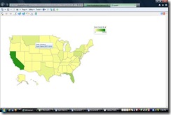
Creating a frequency distribution of which states have the highest (and or lowest) number of level 3 Medicare appeals submitted to OMHA per year would be a great place to begin. Graphing a bar chart with over 50 frequency bars could show ranking or alphabetical order but not regional relationships. Using maps with various color ranges (a type of heatmap) to display which states have the highest concentration levels is generally the favored choice. The top five leading states for 2007 were California (42,469), Florida (17,754), Pennsylvania (8,685), Montana (6,434) and New York (5,752). This a static view of an interactive map from Visualizefree.com. The web version will allow you to click on the state to review the number of OMHA claims.
Figure 1. Total Number of 2007 Medicare Claims Per State

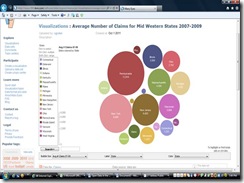
You can also look at the data on a regional level and compare the average number of OMHA claims per state for this three year period. The mid-western region (as defined by the Centers of Medicare and Medicaid Services) is made up of 18 states. A Bubble Chart is a great and fun visual for data sets with lots of values, and best used to compare the magnitude of values for a single variable with a wide range of values. There is also a Bubble Scatterplot which gives a three dimensional perspective for comparing three variables simultaneously. Using IBM’s Many Eyes, Figure 2 shows the top three states with the highest average of contested claims are Pennsylvania (12,018), New York (9,408) and New Jersey (6,403). It appears that the diameters of the bubbles are scaled on a square root or logarithmic scale.

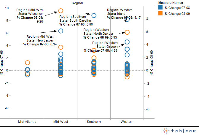
Plotting graphs also allows us to see distribution of values and to easiliy identify the outermost points. If we want to know which states within each region had the highest increase in claims from 2007 to 2008 and from 2008 to 2009, Tableau Public allows the user to be very interactive with the data. In Figure 3, the visual illustrates the concentration of states having just a plus or minus 2% change in claims as well as those that had a 4% – 10% increase in claims from the previous year. The program provides for the identification of all points via point and click on the graph as shown below. There is no need to have a color and legend for each state. And it may lead one to further investigate why Wisconsin, South Carolina, Idaho, New Jersey, North Dakota, and Oregon have the highest number of appealed Medicare claims for this region.
Figure 3. Percent Change in Number of Claims 2007-2008 and 2008 -2009

Storytelling Using Numbers
Visualization techniques help to tell the story about your data and increases data comprehension by looking at the trends and patterns in the data. It is using cognitive maps. In our Medicare claims data example, an interactive, color-toned map of the United States makes for easy recognition and recall of states with the highest claims. You may want to also consider animating your data with a bubble chart. The size of bubble in Figure 2 made it obvious which states had the highest average number of claims. Creativity using shapes and color in graphs as well as scatterplots captures the reader’s attention. It can make comprehension a lot easier and feel more real. Encourage the viewer to take a closer look at the information and to think about the causal dynamic responsible for the representation. The dispersion of points in Figure 3 for example promotes questioning and possibly some additional research to explain the apparent changes in appealed claims levels for individual states.
