
What’s America’s Medical IQ?
Using a picture and visual graphics to represent data and information is called an infographic. It is a great way to display statistical data that shows comparisons or charts that come from research and reports. See below the state of mobile technologies in healthcare today, of Electronic Health Records & the data of healthcare, what ACO trends to watch in 2014 and beyond, and what America’s Medical IQ is. See other infographics we have featured.
The State of Mobile Technologies in Healthcare Today
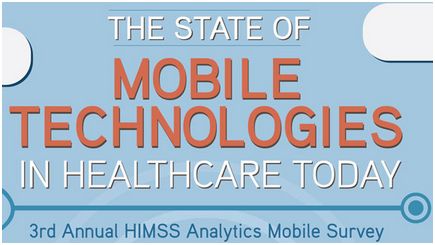 The 3rd Annual HIMSS Analytics Mobile Survey examines the use of mobile devices as they relate to the six areas of the mHIMSS Roadmap, a strategic framework for providers to implement mobile and wireless technologies. This infographic is brought to you by HIMSS Analytics (@HIMSSAnalytics), whose mission is to provide the highest quality data and analytical expertise to support improved decision-making for healthcare providers, healthcare IT companies and consulting firms. See the entire survey.
Electronic Health Records & the Data of Health Care
 This infographic from datascience@berkeley (@BerkeleyData) explores the health data revolution, the difference between Electronic Medical Records and EHRs, which states and practices adopted electronic systems, and what the future of the digital health industry looks like. Get ready for the next wave of medical innovation. See all the details of this infographic.
ACO Trends to Watch in 2014 and Beyond
 With the shifting reimbursement landscape and growing emphasis on coordinated, quality care, ACOs are increasingly becoming a force to be reckoned with. What does the current and future ACO landscape look like? This infographic provides some answers. This infographic is brought to you by CDW Healthcare (@CDW_Healthcare), a leading provider of technology solutions and services focused exclusively on serving the healthcare marketplace. Their customers include more than 15,000 healthcare organizations nationwide — ranging from small physician practices to large hospital systems.
America’s Medical IQ
 Our health is personal. But when it comes to navigating the system that cares for us, many Americans aren’t making the grade. A new survey from the Vitals Index reveals that while two-thirds of people perceive themselves to be a savvy health care consumer, many don’t know how to find quality care at a good value. More than 60 percent of respondents didn’t know basic quality information about their doctor, such as which medical school s/he attended. Younger consumers were the least likely to know which school their doctor attended, and over 10 percent of consumers said they didn’t care. This infographic is brought to you by Vitals (@vitals), who provide increased transparency of cost, quality and access information to support effective decision making when choosing a doctor or medical facility. Vitals brings together actionable data, digital tools and consumer expertise to empower consumers to make more informed, higher-quality and lower-cost decisions about their care.