
Using a picture and visual graphics to represent data and information is called an infographic. It is a great way to display statistical data that shows comparisons or charts that come from research and reports. In these Practice Management infographics, see what the real costs are of getting paid, what Million Hearts is, and where you stand with EHR’s. See other infographics we have featured.
The Real Price of Getting Paid
 When you hear “14 percent,” it doesn’t sound like very much. Fourteen percent of your day is just under three and a half hours – not quite an entire REM sleep cycle. Fourteen percent of a $50 restaurant tab is seven dollars, the cost of an appetizer. But when you realize that physician practices spend 14 percent of their bottom line just to collect patient payments, this amount no longer seems insignificant. See the complete infographic for more details.
This infographic is brought to you by Navicure (@Navicure). Navicure’s cloud-based claims clearinghouse and patient payment solutions help healthcare organizations of all sizes increase revenue, accelerate cash flow, and reduce cost in the course of managing insurance claims and patient payments.
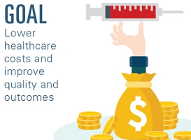
What Is Million Hearts?
 Million Hearts® is a national initiative to prevent one million heart attacks and strokes by 2017. Million Hearts® has the potential to help improve the health of millions of Americans by improving the ABCS: Aspirin When Appropriate, Blood Pressure Control, Cholesterol Management, Smoking Cessation
See fast facts about heart attacks and strokes in the complete infographic.
This infographic is brought to you by HealthIT.gov (@ONC_HealthIT). Health information technology (health IT) makes it possible for health care providers to better manage patient care through secure use and sharing of health information. Health IT includes the use of electronic health records (EHRs) instead of paper medical records to maintain people’s health information.
Electronic Health Records – Where Do You Stand?
 See where the money is going, what plans are underway, who is ready for meaningful use and who is not, and why data breaches are causing headaches. View the complete infographic.
This infographic is brought to you by Logicalis (@LogicalisUS), who want to be a valuable partner for their customers, to provide opportunity for their employees, and contribute to their communities. And, like you, they know that the innovative use of information technology (IT) is one of the best strategies to achieve their business objectives.