
Using a picture and visual graphics to represent data and information is called an infographic. It is a great way to display statistical data that shows comparisons or charts that come from research and reports. In these infographics, see what hospital readmissions are really costing, why the patient experience should be a top priority for any hospital, how pop health is effected by the communication breakdown between doctors and nurses, and how important hospital branding is. See other infographics we have featured.
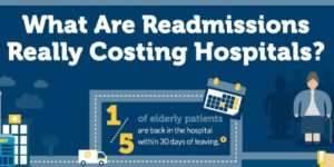 Hospital Readmissions
In 2014 alone, hospitals stood to lose as much as 3% of their Medicare payments for high readmission rates. Leading hospitals are now realizing that the benefits of telemedicine can help to reduce costly and avoidable readmissions through better patient care and increased access to specialists. Learn more about what readmissions really cost hospitals in this infographic brought to you by ProConnections.
ProConnections (@ProConnections1), a privately held company, is an established leader in the design, development and manufacturing of innovative audio/visual solutions. Collectively, our engineers have almost a century of experience working in digital imaging, data compression and embedded software development to provide real-time data reliability in the ever-changing internet network landscape.
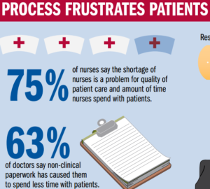 Patient Experience
Consumer experience should be a top priority for any hospital today. Reputations rely on how the community perceives your organization. See what processes frustrates patients and providers and what can be done to make a difference in this infographic by BerylHealth.
BerylHealth’s success is rooted in commitment to purpose, core values and delivering value to their clients. This foundation shapes the culture and defines the character of their company, guiding decision making as well as their interactions with their clients, patients and each other.
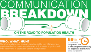 Population Health
A fundamental problem stands in the way of improving population health and transitioning to value-based care delivery models: doctors and nurses struggle to get in touch with each other in a timely manner to coordinate the care of their patients. Perfect Serve’s infographic highlights the communication challenges experienced by patient care team members and how technology is not being utilized appropriately to improve patient care.
PerfectServe (@PerfectServe) is a single, unified communications platform that connects clinicians in any care setting, across the care continuum, inside or outside of your organization. Importantly, PerfectServe solutions can help you drive meaningful improvement in your care delivery processes.
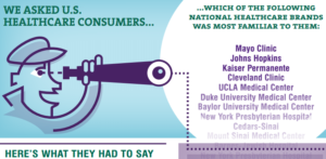 Hospital Branding
An infographic from National Research Corp., culled from its 2014 Market Insights Study of National Brands, shows that Mayo Clinic, Johns Hopkins, Cleveland Clinic, and Kaiser Permanente are in the top echelon in terms of national name recognition and reputation.
For more than 30 years, National Research Corporation (@NatlResCorp) has been at the forefront of patient-centered care, helping healthcare providers measure and improve quality and services through analytics that offer a rich understanding of customers’ experiences, preferences, risks, and behaviors.