
Recently Published Healthcare Infographics
Using a picture and visual graphics to represent data and information is called an infographic. It is a great way to display statistical data that shows comparisons or charts that come from research and reports. These are some healthcare infographics I have come across lately.
Electronic Health Records – How do they connect you and your doctor?
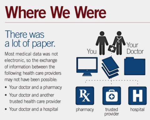 This healthcare infographic presents data between 2001 and 2011 of the growth of doctors using EHRs. The premise is that moving from paper to electronic records will make it easier for the patient and their doctors to coordinate care along with reducing medical errors. The bigger picture is the history of EHRs and where they are headed in the future. View this infographic compliled by the ONC.
Protecting Patient Privacy – how important is it?
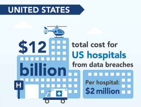 This healthcare infographic compares the US and Canada when it comes to HIPAA privacy. It is costing US hospitals $12 billion from data breaches. In Canada, 21% of providers have never conducted a medical security audit. The Canadian data was compiled from Shred-it Information Security Tracker. The US data comes from the Ponemon Institute 2010 Benchmark Study on Patient Privacy and Data Security. View this infographic created by Shred-it.
2013 Medical Data Breaches: A Source of Chronic Pain
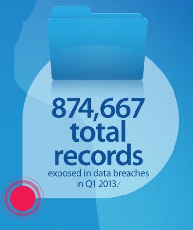 This healthcare infographic displays 2013 medical records that have been exposed in data breaches. 21.7 million patients have had records exposed in healthcare data breaches. Less than 1/3 of organizations encrypt sensitive data. The infographic was created by Experian Data Breach Resolution. There are many sources listed for the data including the US Department of Health and Human Services, Ponemon Institute Benchmark and other Studies, and the Identity Theft Resource Center.
American vs. National Health Care
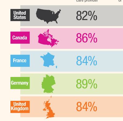 This healthcare infographic focuses on five countries United States, Canada, Germany, France and the United Kingdom. It shows the differences and similarities in health care utilization, routine check-ups by gender, and the perception of adequacy of health insurance coverage in each of the countries. View this infographic and article from GoHealth.
Analytics: The Nervous System of IT-Enabled Healthcare
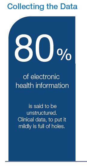 This healthcare infographic starts with the premise the healthcare industry is moving from volume-based reimbursement to value-based reimbursement that is designed to achieve higher quality, lower costs, and a better patient experience. To succeed, healthcare providers are forming accountable care organizations (ACOs) and restructuring their care delivery systems. Why analytics? View this infographic from iHT2, Institute for Health Technology Transformation. You can also download the research report that was the source of the data.