
Using a picture and visual graphics to represent data and information is called an infographic. It is a great way to display statistical data that shows comparisons or charts that come from research and reports. In these Health IT Adoption infographics, see how the body can be a source of big data, how healthcare IT is transforming, how physicians are adopting health IT, and what the costs are of data center outages in healthcare. See other infographics we have featured.
The Body as a Source of Big Data
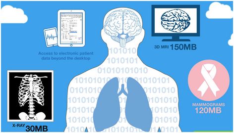 Today data storage is essential for healthcare providers to see a patient’s complete story of care, make the most informed decisions and enhance treatment and outcomes. See the details of this infographic.
This infographic is brought to you by The Institute for Health Technology Transformation (@iHT2), a the leading organization committed to bringing together private and public sector leaders fostering the growth and effective use of technology across the healthcare industry.
Healthcare is Transforming—and so is Healthcare IT
 Change is happening fast, faster than you think. Healthcare providers need to view patients as consumers-and know all about them before they even arrive. Healthcare providers must be prepared for emerging needs in Storage/Vendor-Neutral Archiving, Patient Engagement/Telehealth, Mobility/BYOD, Healthcare IT/Disaster Recovery, and Analytics/Big Data. View the entire infographic.
This infographic is brought to you by Logicalis (@LogicalisUS), who want to be a valuable partner for their customers, to provide opportunity for their employees, and contribute to their communities. And, like you, they know that the innovative use of information technology (IT) is one of the best strategies to achieve their business objectives.
Annual Check-Up on Physician Adoption of Health IT
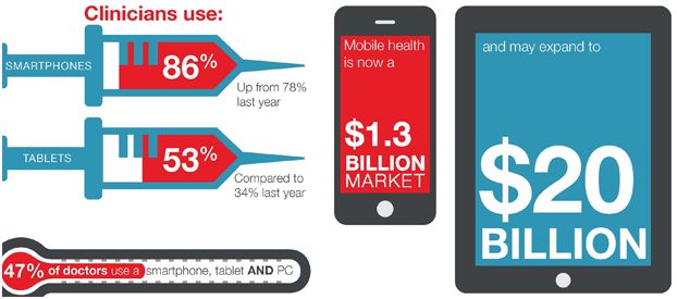
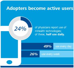 Since 2011, the Deloitte Center for Health Solutions has annually polled a nationally representative sample of the U.S. physician population to understand perspectives and attitudes about health care. Deloitte’s 2014 Survey of U.S. Physicians examined physicians’ current use and overall views of mobile health (mHealth) technologies, Meaningful Use (MU) and electronic health records (EHRs). See the results from the survey and view the entire infographic.
This infographic is brought to you by Deloitte (@DeloitteUS). In the United States, Deloitte LLP and its subsidiaries have 65,000 professionals with a single focus: serving their clients and helping them solve their toughest problems. They work in four key business areas — audit, financial advisory, tax and consulting — but their real strength comes from combining the talents of those groups to address clients’ needs.
The High Costs of Data Center Outages in Healthcare
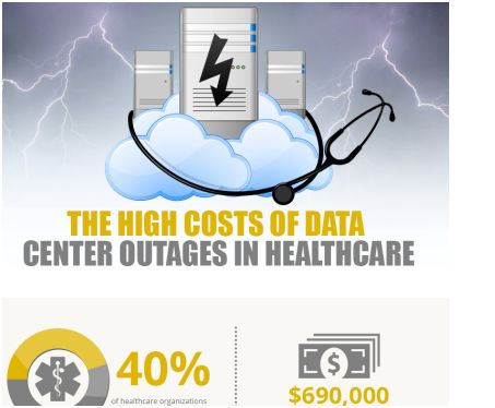 Forty percent of healthcare organizations have experienced an unplanned outage. The average costs healthcare organizations per unplanned data outage are $690,000. See what the most common costs are and the average length of time for unplanned outages in the complete infographic.
This infographic is brought to you by ClearDATA (@ClearDataNet), the nation’s fastest growing healthcare cloud computing company. More than 300,000 healthcare professionals rely on ClearDATA’s HIPAA compliant cloud computing infrastructure to protect their patient data and critical applications.